
Page 3 - Australian Pork Newspaper
P. 3
What the statistics are telling us now
☛ from P1
75kg hot standard carcass weight, expressed pro- portional to the price in November 2010 (as 100).
The high demand growth at retail seems to have led to higher de- mand for pigs at the farm gate, and with a limited number of pigs available, higher prices were where we see the demand in- crease being realised.
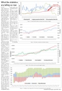
Figure 3 shows the next major change that pre- empted our present over- supply situation.
It shows how in around June 2016 there was a significant shift upwards in production growth (for this graph, expressed as the moving annual to- tal production volume of pork in Australia in- dexed to November 2010 as 100).
There can be some de- bate about the links of this production increase to the price increases commencing August 2015.
For example, was it simply a market response whereby given the very healthy prices and as- sumed profitability in- creases, increasing pro- duction was an attractive financial option for pro- ducers?
Alternatively, was it that producers were investing their improving profits back into their facilities to improve productivity, and thereby increasing production?
It was probably a mix of both, but we know the ultimate consequence, which was to see pig prices crash from Janu- ary 2017, when it became clear the market was oversupplied.
Through our APIQP quality assurance system, the PigPass movement re- porting system and our Australian Pork Limited membership system, we collect data about breed- ing sow numbers in the Australian herd.
These numbers haven’t always been highly ac- curate, especially the fur- ther back you go.
Irregular clean-ups of the data led to some lumps and bumps in the figures along the way but because we’ve been improving the ways we do this, including better cross-checking between systems, we believe the numbers we have today are fairly reasonable.
The trend over time – also shown in Figure 3 – can also be considered reasonably representative of reality.
Figure 4 shows these breeding sow numbers since October 2013 (note this is more recent than the other graphs, which start at November 2010).
It shows how breed- ing sow numbers have increased since this time, but interestingly, they don’t line up very well with the increase in slaughter numbers (the angle of the lines can be compared because the axes are to scale).
Slaughter numbers are
moving annual totals and supplied through the Australian Bureau of Sta- tistics.
However, if we divide our annual slaughter numbers by our sow num- bers (giving us one of our productivity indica- tors, which is pigs sold per sow, per year), this seems to have grown more closely with the development in slaughter numbers (again, you can compare the angles).
This is shown in Fig- ure 5.
There are really only three things that can con- tribute to higher pork production volumes over time.
They are (1) more breeding sows, (2) high- er productivity per sow (more pigs per sow, per year) and (3) heavier car- cass weights.
Adding the Austral- ian Bureau of Statistics carcass weight data to that you’ve already seen expressed in the graphs above, we can do an anal- ysis of which of these three contributors has had the biggest impact on pork production growth over the past five years or so.
This has been done in Figure 6.
The results of this anal-
☛ continued P4
Figure 3 – Demand growth, pig prices and pork volume production (supply).
Figure 4 – Breeding sow numbers and slaughter numbers.
Figure 5 – Pigs sold per sow, per year and slaughter numbers.
www.porknews.com.au
Australian Pork Newspaper, August 2018 – Page 3
Figure 6 – Contributors in percentage terms to the increase in pork production since October 2013.
